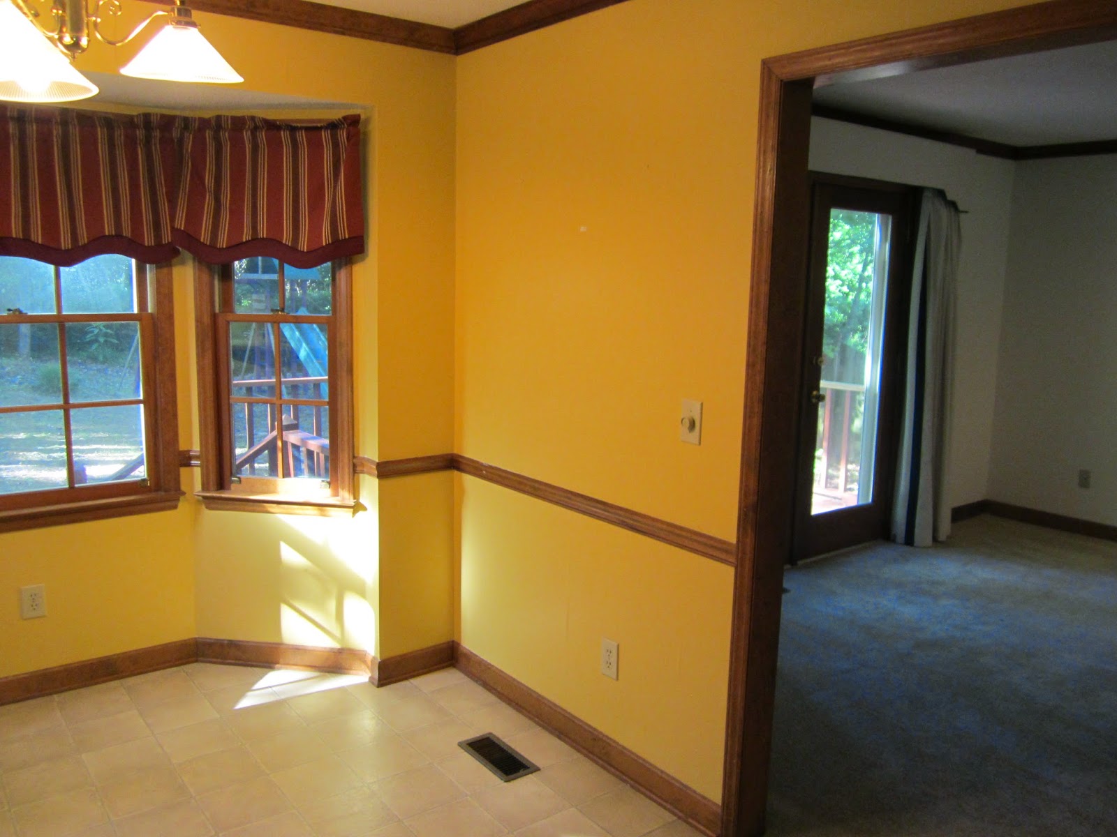
With a new light and new windows last year, and a cute and practical window seat built by my dad this winter, the walls around it were just begging for a makeover.
We knew we wanted something light and bright, but our first color choice was a bust. We went with Sherwin Williams Snowdrop (very light blue) in satin finish, but after three coats, it just didn't give enough of a contrast against the white trim. We tried to like it, but a few days later ended up doing one of Tommie's worst nightmares…repainting.
Sherwin Williams Snowdrop in satin finish (first attempt)
We decided/learned that colors at the very top of the color chip were just too light for us, so we moved down on the spectrum and went with Sherwin Williams Tidewater (light teal) in satin finish. I happen to like this color anyway, so I trusted I'd like it on the wall too. It's light, yet soft and inviting.
Sherwin Williams Tidewater in satin finish (second attempt)
It makes the room look sophisticated, but young and modern, too. The only downside is that the kitchen now looks extra drab next to it.
Half beauty/half beast
Still, it makes me happy to see how far it's come. I know we'll get to that ugly kitchen someday.
(Before)
(After)
(Before)
(After)


