October 11, 2015

Bathroom Vanity Makeover

Our guest bathroom vanity and cabinet just got a makeover that we're excited to share! Instead of getting a whole new vanity, which is hard to match the footprint of the original and can be quite costly, we decided to paint it and replace the hardware.
Original oak vanity in downstairs and guest bathrooms
The original cabinet was dark-patterned oak. It's hard to get the grain to disappear with a light colored paint, so we went with the same rich dark grayish/blue color we painted our hallway banisters (Grays Harbor by Sherwin Williams in a glossy finish, so it's easy to wipe off). It gives the finish a sleek and modern look.
Bathroom vanity painted with new hardware
We found an 8 pack of contemporary handles reduced at Lowes because it was missing two handles. We also got new silver hinges.
Guest bathroom before 
Guest bathroom after
The floor-to-ceiling cabinet next to the vanity also got a makeover. For such a tall built-in, the dark oak made that space next to the door claustrophobic. To give it a more open feel, we removed the cabinet doors completely, turning it into open shelving, and painted the entire thing white (the same semi-gloss white we've used on all our trim). So much brighter!

It came out so well, we're planning to do the same thing to our downstairs half bath and the double vanity in the bathroom. 

September 26, 2015

Slowly Going Stainless in the Kitchen

With not that many walls left to paint, we're starting to look ahead to the bigger and more involved house projects…like the kitchen and bathrooms. These spaces are investments. They cost a lot, but they also add the most value. Still, we're going to need to tackle them in pieces so we don't go into debt trying to do it all at once.
Old dishwasher
When our dishwasher started leaking all over the kitchen floor a few months ago (it was about 30 years old, so I can't blame it!), it forced us to start making upgrades to our appliances. The dishwasher, for obvious reasons, had to come first. We bought a floor model to save a couple hundred dollars, but it turns out that was broken too (floor models are 50/50 chances…they are either great deals or bad mistakes and we lost on this one). Luckily, the store was able to replace it at no cost with a newer model (Samsung in stainless steel).
New dishwasher (Samsung stainless steel)
I thought the stainless steel would stick out and make it so obvious that the rest of our kitchen looks hideous, but in reality, the steel actually blends in MORE with the space. It's a welcome change from the old bisque and black appliance.
Before and After
With that initial change in the kitchen, we decided to hire a contractor to complete a project we've been wanting to do since we moved in…venting a range hood to the outside so that grease and steam can escape our kitchen (the original vent was non-ducted). 
Old hood
It made sense to get a vented hood in place before making a lot of other changes to the kitchen and getting them covered in grease.
Venting to the outside through the upper cabinets
We chose a sleek stainless steel Broan under cabinet hood (QML30SS) that's not overly fancy, but will do the trick for normal kitchen cooking. We had the contractor run a 7" round duct through the upper cabinets (which we really don't use anyway) and install a vent cap outside. We could have used smaller duct work but the 7" allows the vent to work at max capacity, so we went with that.
New hood (Broan stainless steel)
New range hood
This winter, we're hoping to upgrade the stove and maybe start to tackle painting the upper cabinets and replacing the door faces which would really help brighten the space. We'll work our way down from there (eventually getting to the countertops and floors).

April 14, 2015

Hallway of Gray

We finally got around to painting our stairwell/hallway and risers, though admittedly, with the help of a professional painter who had ladders that could reach our 16-foot high ceiling.
 For comparison...here is the before picture:
The color we used is the same silvery gray (Samovar Silver in satin finish by Sherwin Williams) painted in the living room and dining room. It's a neutral shade that we're using in various parts of the house to help unify the spaces and balance out some of the other crazy colors we've painted on accent walls, etc.

The risers were painted white to match the trim and banister spindles.
Once again, the before picture when the only color the house knew was "oak:"
The gray walls look great with the banister and create a two-tone effect (with a deeper darker grayish blue on the rail). Now both the upstairs and downstairs oak has been transformed and the institution-style white scuffed hallways are a thing of the past. 
Aside from a few doorways and, of course, the ugly kitchen, this concludes most of the painting on both levels. (Notice how moving on to more expensive projects means less projects getting done at all.) Over time, we'll start tackling some of the bigger projects and I'll continue to share them here.

February 14, 2015

Freshen up the Laundry Room

Our laundry room is a small space in the back hallway that's been getting upgraded slowly over the past year, including painting the oak cabinets white, painting the trim and walls, my dad building a custom shelf, and getting a new washer and dryer!
Laundry room before
Laundry room after with painted cabinets and new washer/dryer
Laundry room before
Folding shelf in progress
Laundry room now


The color is a shade of blue-ish periwinkle, but I don't know exactly because it was a can of $3 "mistake paint" from Lowe's.

Whatever the color is, it inspired us to go with a bit of an "underwater" theme; check out the porthole mirror with the whale swimming through it.
Other than the unflattering buzzing florescent light in there, our laundry room is pretty much complete and it feels good to have another space checked off the list! 

January 25, 2015

Torching the Torch Lights

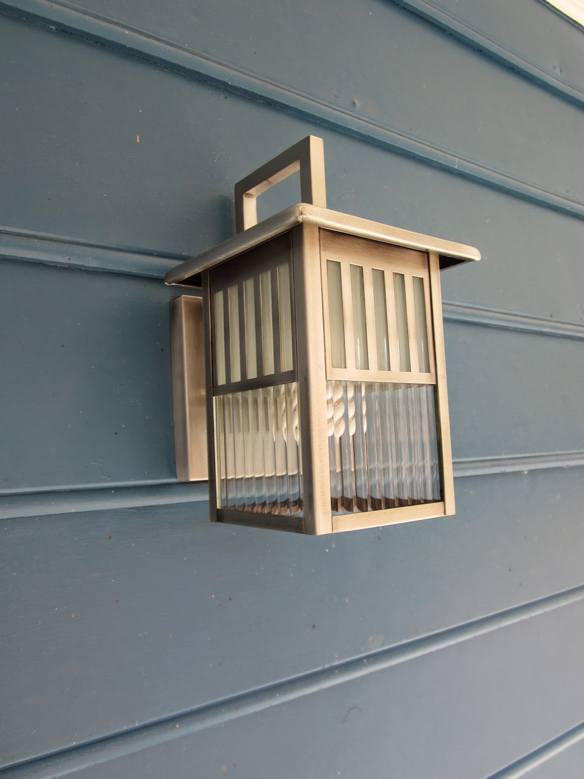
Ever since we had the exterior of our house painted over 14 months ago, I've been dying to update the front porch lights. The oxidized brass torch lights from the 80s looked so dull and old up against the new bright house, but I struggled to find a style my husband and I liked, and one that fit the "look" of the house.
Old light
We didn't like any of the exterior lights Home Depot or Lowes had in stock and we didn't like anything we saw online that was in our price range…until I stumbled across this guy on Overstock.com
New light
At the time we purchased it, it was under $50 and we were sold on the simple, mission-style modern design.
Before
After
As with any house project, there was a catch. The screws the light came with were too long, causing the light to hang off the wall. 
We had to make a Lowes run to get a pack of smaller machine screws with washers and thankfully that did the trick.
The sleek silver light blends in much better with the rest of our updated exterior and it even gives off more light. Another small project checked off the list!

January 12, 2015

Future Foster Kids Room

This winter, we finally started to redo the third bedroom, dubbed "the kid's room." But we don't have kids and we're actually not "having" kids at allour hope is that one day this will be the space for our future foster kids. 
Even though we still have a ways to go in the application process before actually becoming licensed foster parents, it was important for us to move forward and get the room "ready." It helps visualize actually having a child in there someday.

Before its makeover, the third bedroom was a very faint blue; there were lots of holes in the walls and the windows were a safety hazard as they slammed shut, so we knew we had repairs to make along with cosmetic changes. 

Here's a before and after shot:

(Third bedroom before)
(Third bedroom after)
The main changes include painting the room a light greenish/yellow (the color is Springtime in satin finish from Sherwin Williams); adding furniture, which is second-hand or from Craigslist; putting up branch-themed curtains and a matching modern branch stencil-cut desk chair.

There are also new vinyl windows that aren't a safety hazard anymore and an assortment of colorful art on the walls, including cute animals (from Fab.com), globes and maps, and magnetic strips for hanging personal photos or being creative with magnetic poetry.

The other two walls (not pictured) are still in progress. We have a second twin bed to put together and I want to put book slings on the wall in place of having a bookshelf.

The biggest challenge for this room is designing a space that could be for any child, any age, girl or boy (though I know my style leans more towards "girly"). I expect we'll have to make some changes as we go along, but for the initial setup our main goal is to have this room be a cozy, cheery and welcoming space for whoever arrives at our door someday.

October 19, 2014

Minted Master Bath

Have you ever started to paint a room then moved on to another project before finishing, leaving the room mid-paint job for an embarrassingly long time?

Well, that's what happened with our master bath. Technically, it's only part of our master bath. We have a crazy big vanity/sink area which is separate from the toilet and shower which is a tiny room of its own. We painted one wall of this tiny room last summer, then we moved on to more prominent rooms and left the bathroom a quarter-way done.


This past week, however, I felt motivated to finally finish the job. This small mint and gray bathroom on Pinterest served as my inspiration:

Inspiration
http://www.apartmenttherapy.com/mollys-coloring-book-modern-apartment-house-tour-184045#gallery/42058/17
To get a similar effect, we went with Valspar Ultra Kitchen+Bath, Paint + Primer in Mint Gala.

Here are the before and afters:
Before
After
Before
After
Everything in the room is new—from the window itself to the valance (from Etsy) to the shower curtain (from Target) to the toilet (from Lowes) to the door knob (from Lowes). It only took me a year to paint all four small walls and finish the job, but better late than never!